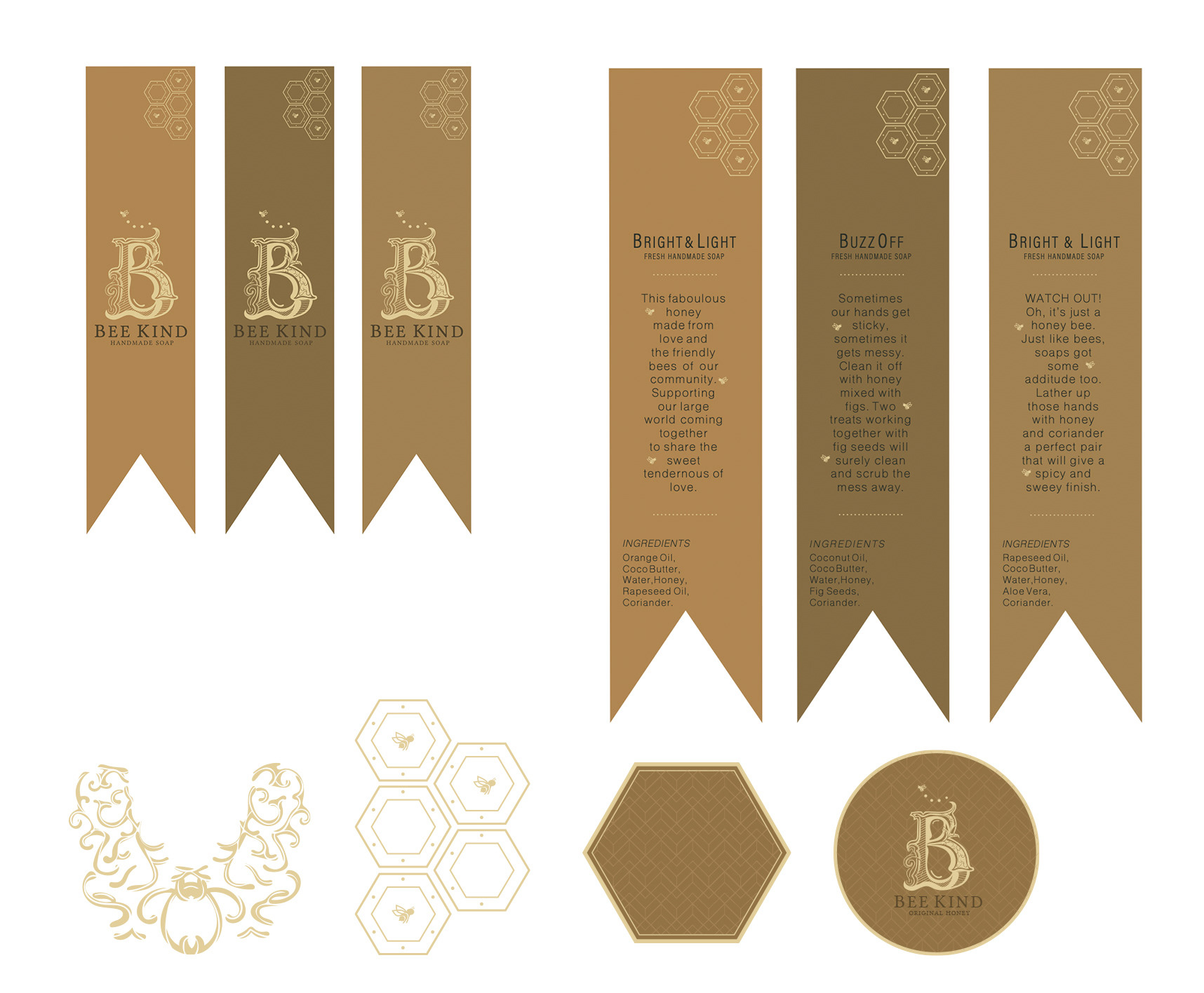
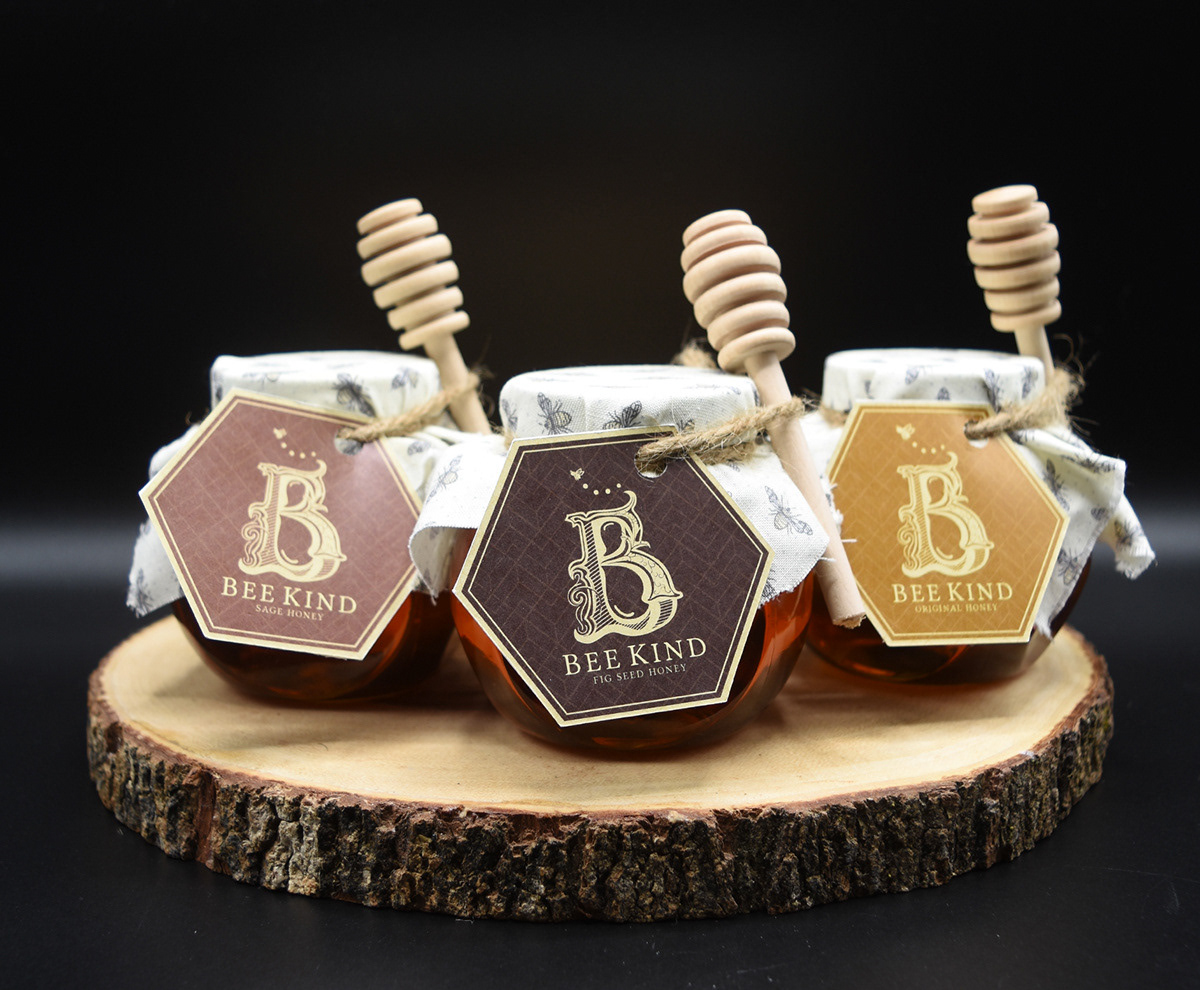
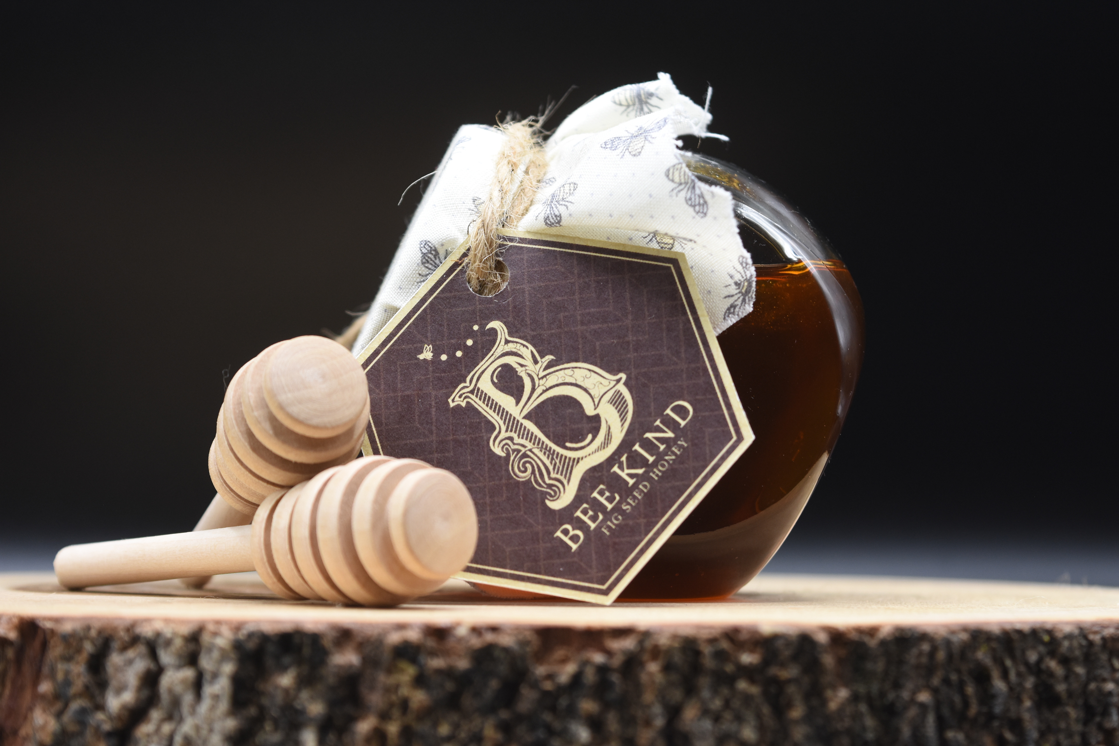
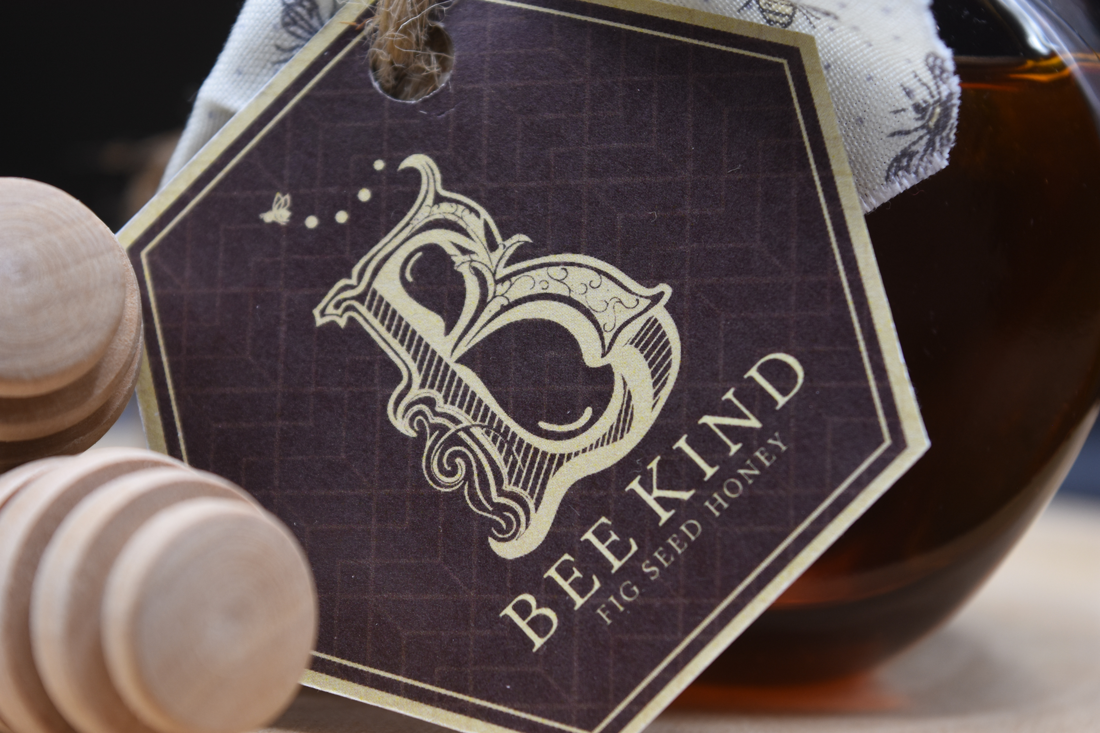
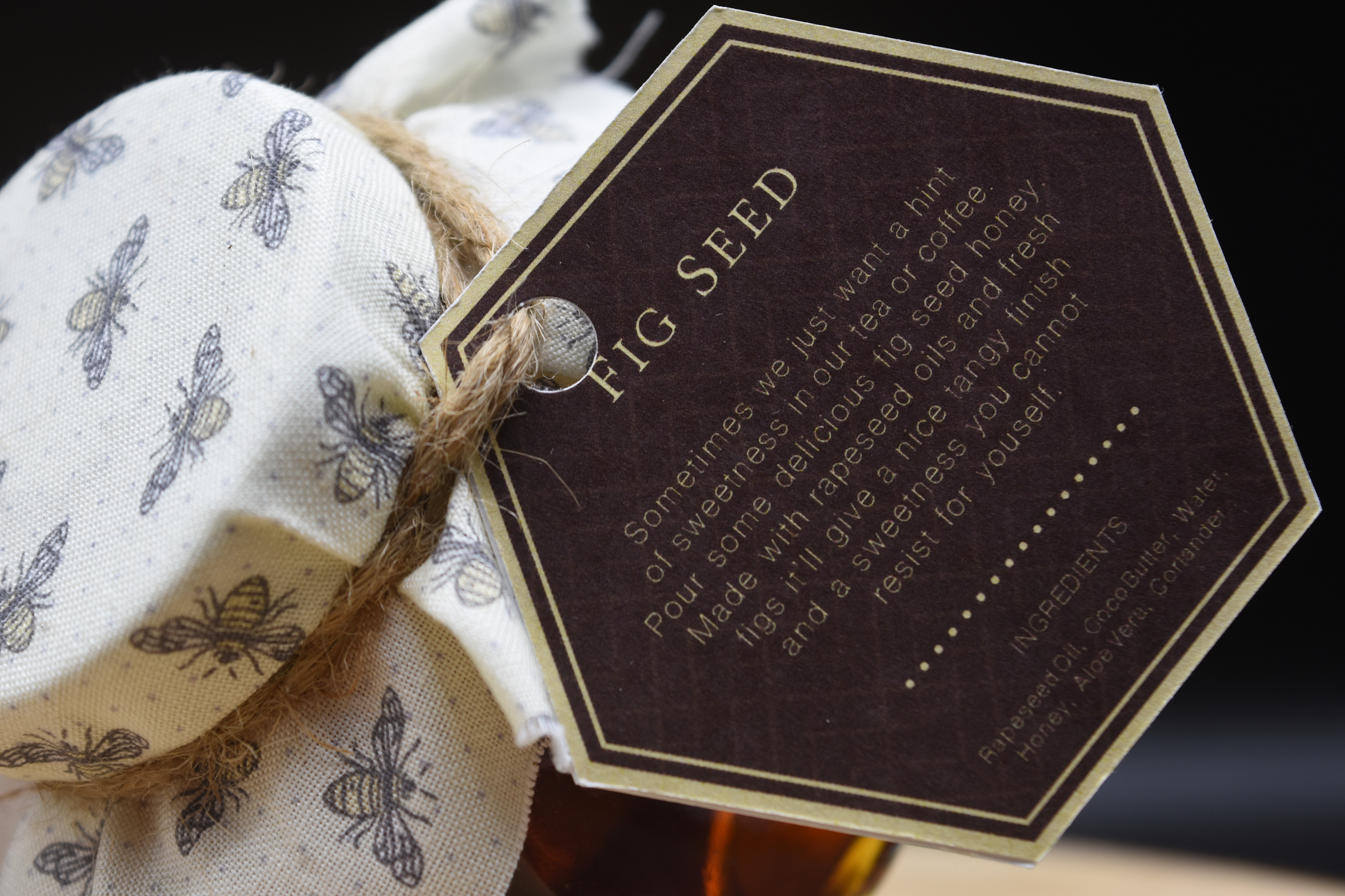
CONCEPT
Bee Kind is a packaging design product to give back to the bees. Inspired by our friendly buzzing friends. The design tags are created in a hexagon shape and with a large capital B with details to indicate handcrafted and with its outer counter in the shape of a honey drop. The idea was to create an eco-friendly packaging that constituted of recycling products.
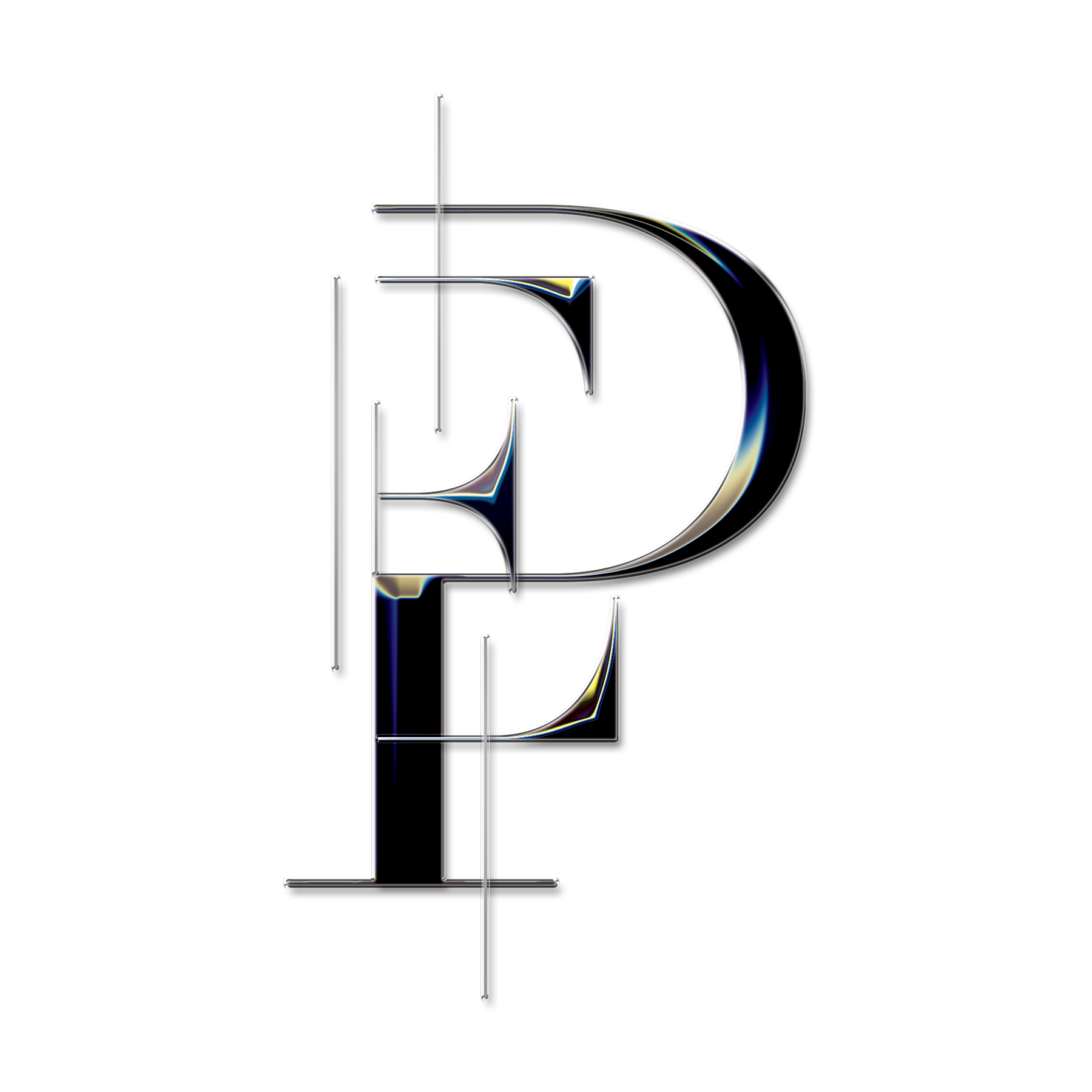
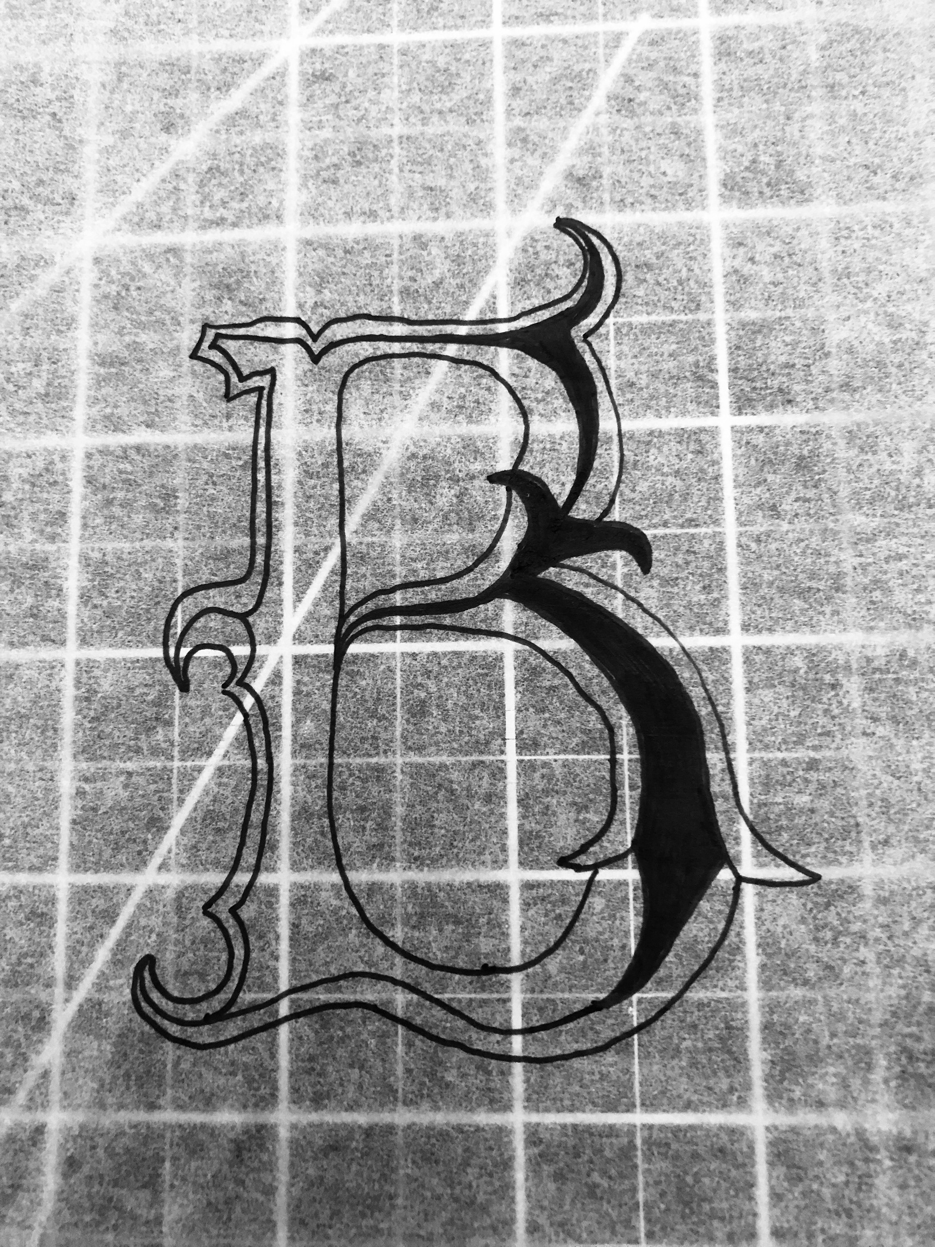
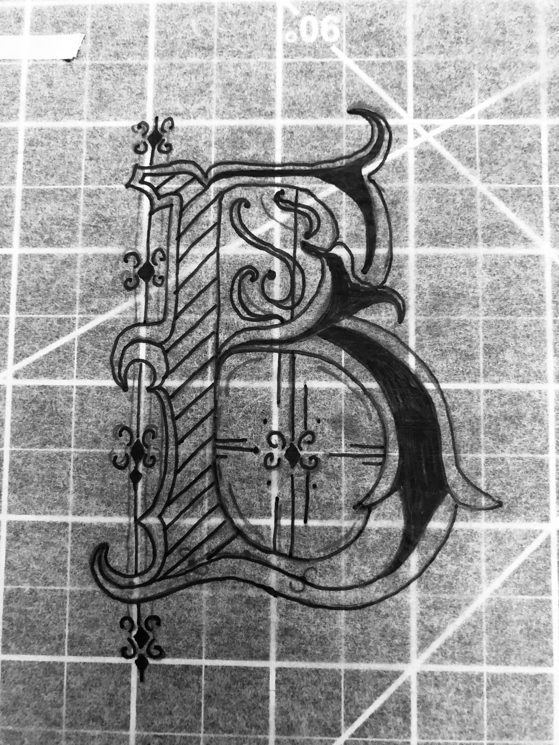
PROCESS OF LOGO
In the beginning stages of the logo, I wanted the letter B to signify the importance of the design. I began with the structure of the letter, then added embellishments and thick and thin strokes. Some of the embellishments I first did, were inspired by Italy's Gothic Architecture from the 13 century. However, when I vectorized the logo somethings, didn't look well as it did on paper, so I changed things up. I focused the counter of the letter and manipulated it to drops to present honey. With that, the final logo that I created was up to pare.
PROCESS OF MATERIALS
As for the materials, I originally thought of adding a banner strip on the jar, but it wasn't reading how I wanted, and the design itself was too flat for me. So I started thinkings of tags instead of paper strips. This is the first process where I transformed these banners to the hexagon tag I now used for the packaging.